INDUSTRY- Cosmetics
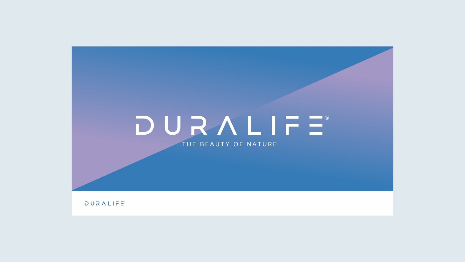
The Beauty of Nature
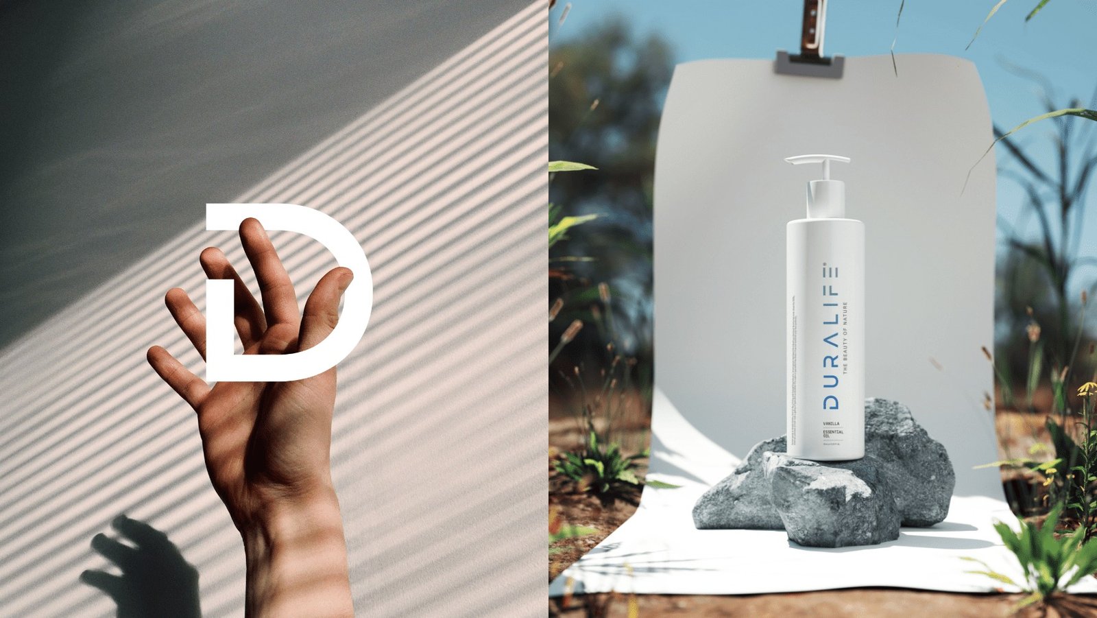
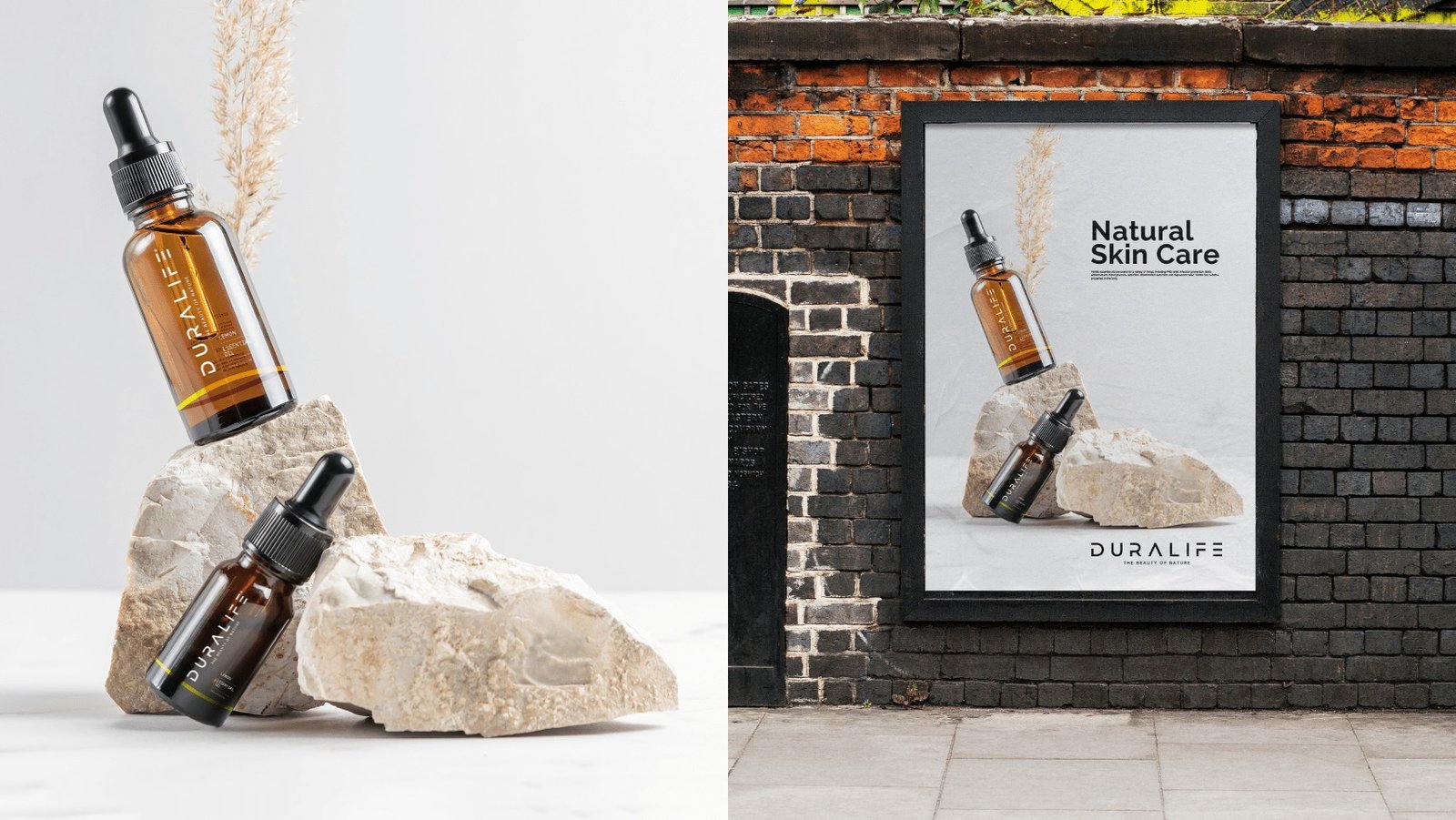
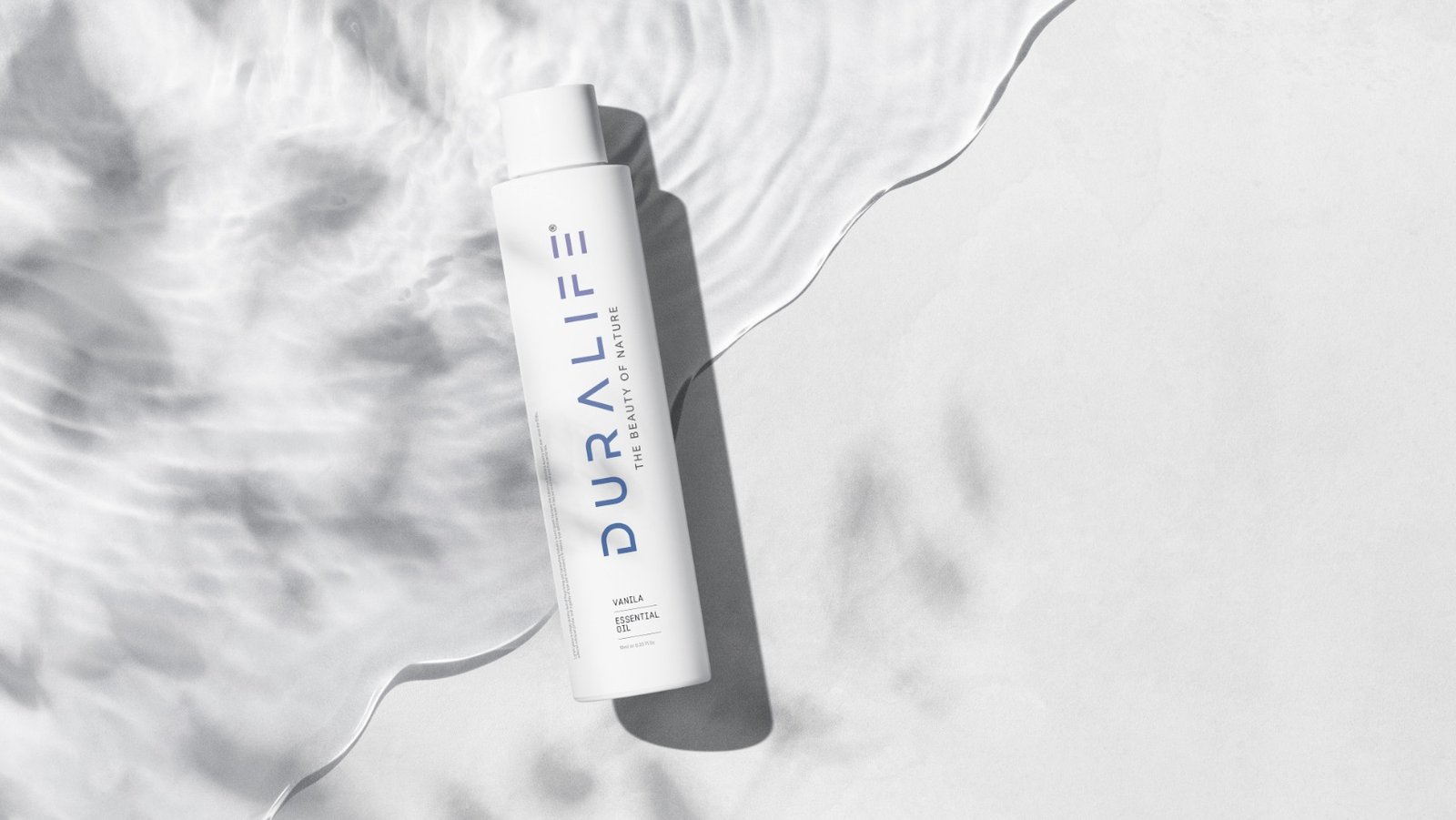
Duralife is a Kuwait based branch that focuses on skin, cosmetic and personal care products. The brand produces clean and non toxic products and it has been designed by renovation general trading and contracting company, Kuwait. Their products are environment friendly and ethically sourced.
What was our part in branding?
The brand with all its pros and goodness had trouble reaching out to the audience and sought a better brand position through rebranding. The branding included making design edits to the logo and the way the logo was used and placed in different places, such as packaging, business cards, and advertisements. The essence of nature was well-captured with the new color code and revamped strategy to position the brand.
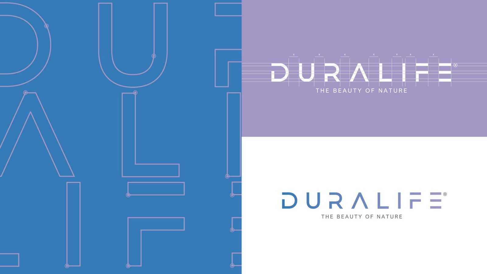
Brand Identity
The earlier logo was quite complex with an orange shade which was not the best we could use. The current logo has been simplified by removing the flower element and changing the font to Neue Vektor normal. In addition, soothing colors are used to keep the logo simple and appealing.

Branding Color Palette
The colors used for the rebranding of Duralife include pastel colors, pink and blue, which symbolize softness, warmness, and happiness through the brand’s visual identity.