INDUSTRY- Cosmetics

As pure as nature

Ayurve focuses on natural skin care products and other cosmetics. They promote environment-friendly products and keep the customer as the important factor. The company has evolved with the goal to replace synthetic and harmful products both for us and the environment.

What was our part in branding?

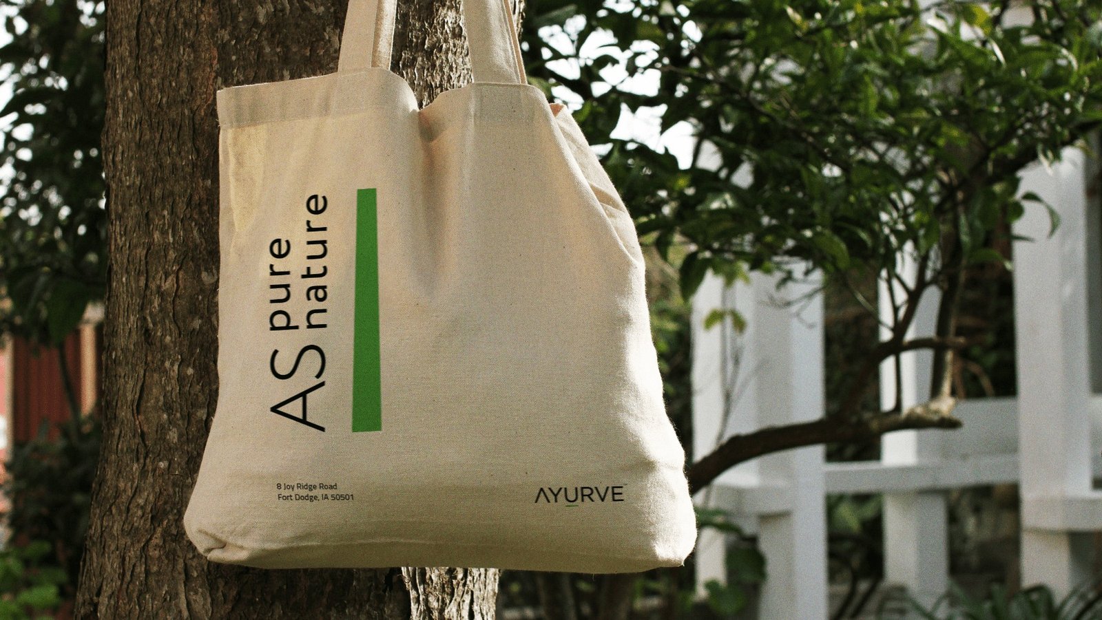
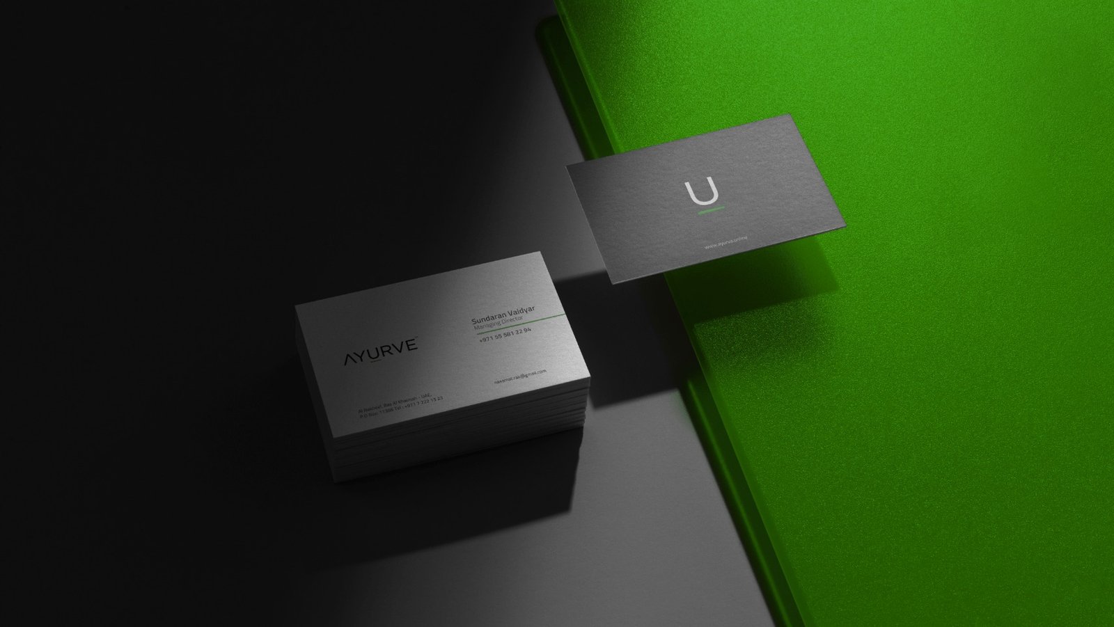
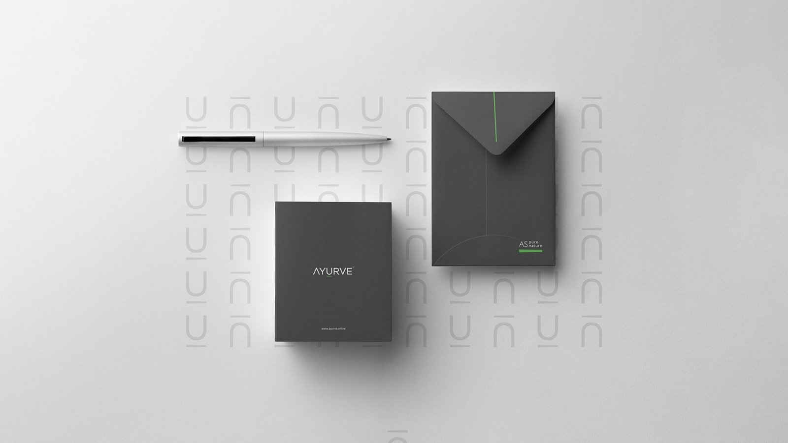
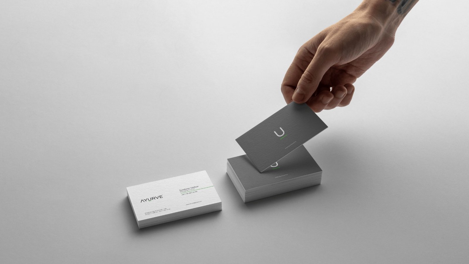
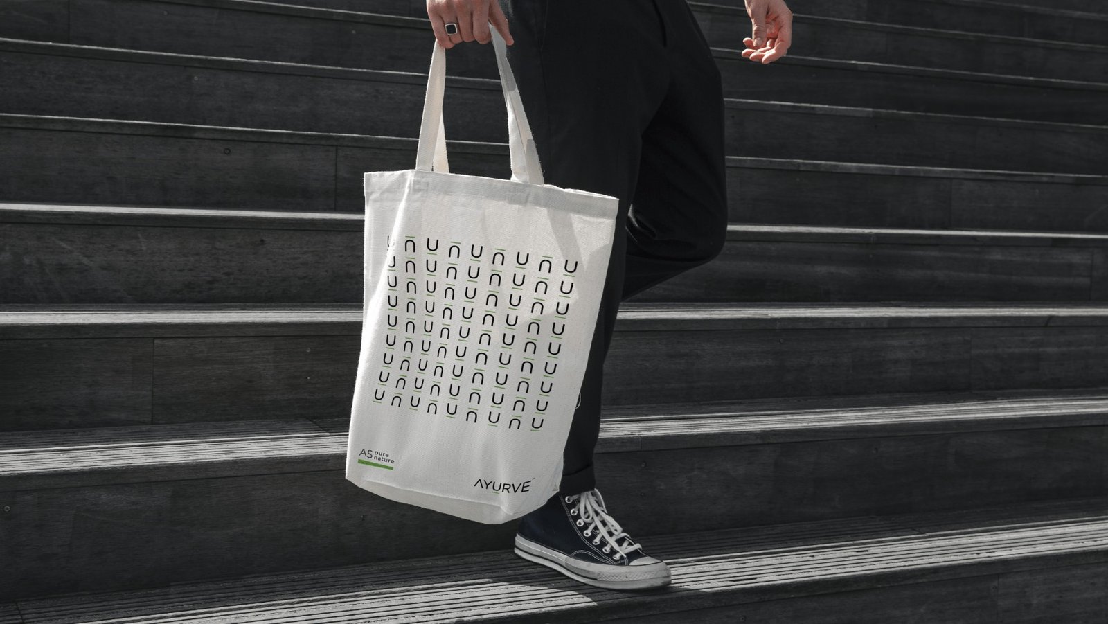
The cosmetic company required something unique but simple to convey its vision. We rebranded Ayurve with a new logo design, giving it a new identity. This was a challenge as the logo has to be concise but convey the message effectively. Further, we designed their goody bags, business cards, stationery, and shirts. The logo and colors were picked keeping in mind the purity of nature and ease of understanding the brand.

Brand Identity

The logo comprises the mortar and pestle set used to crush and get herb extracts. The “U” represents the bowl and the consumer using it, while the uneven line represents the pestle that quashes the herb.

Branding Color Palette

The color palette used includes white, green, gray, and black. Green and white are the most prominent colors, where green symbolizes wellness and growth while white shows purity.

You might also like

Happiness Inside

Inspired by your choice

Al Asalah

Sea and Taste

Happiness Inside

Inspired by your choice

Al Asalah

Sea and Taste

Want your brand to do the talking?

Ybrands

Subscribe